Disambiguating sub-tasks by changing microcopy
Scenario
One of my favorite features of the Dropbox app is the ability to scan documents directly from my phone. But when I am pushed to the “save settings” page after scanning an image, I always encounter friction at one particular point.

After giving the file a name, I can change the “save location” by clicking on “choose a different folder.”
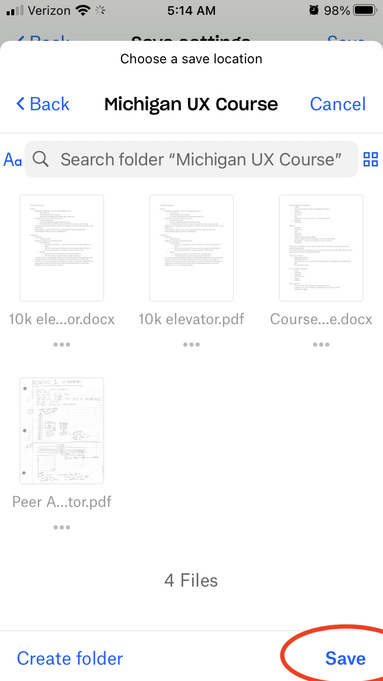
Doing so brings me to a full-screen pop-up where I can choose another folder as the “save location.” I hit “save” on the bottom right of the screen and quickly move on to other things.
Only later do I realize that the scan has not been saved and is nowhere to be found.
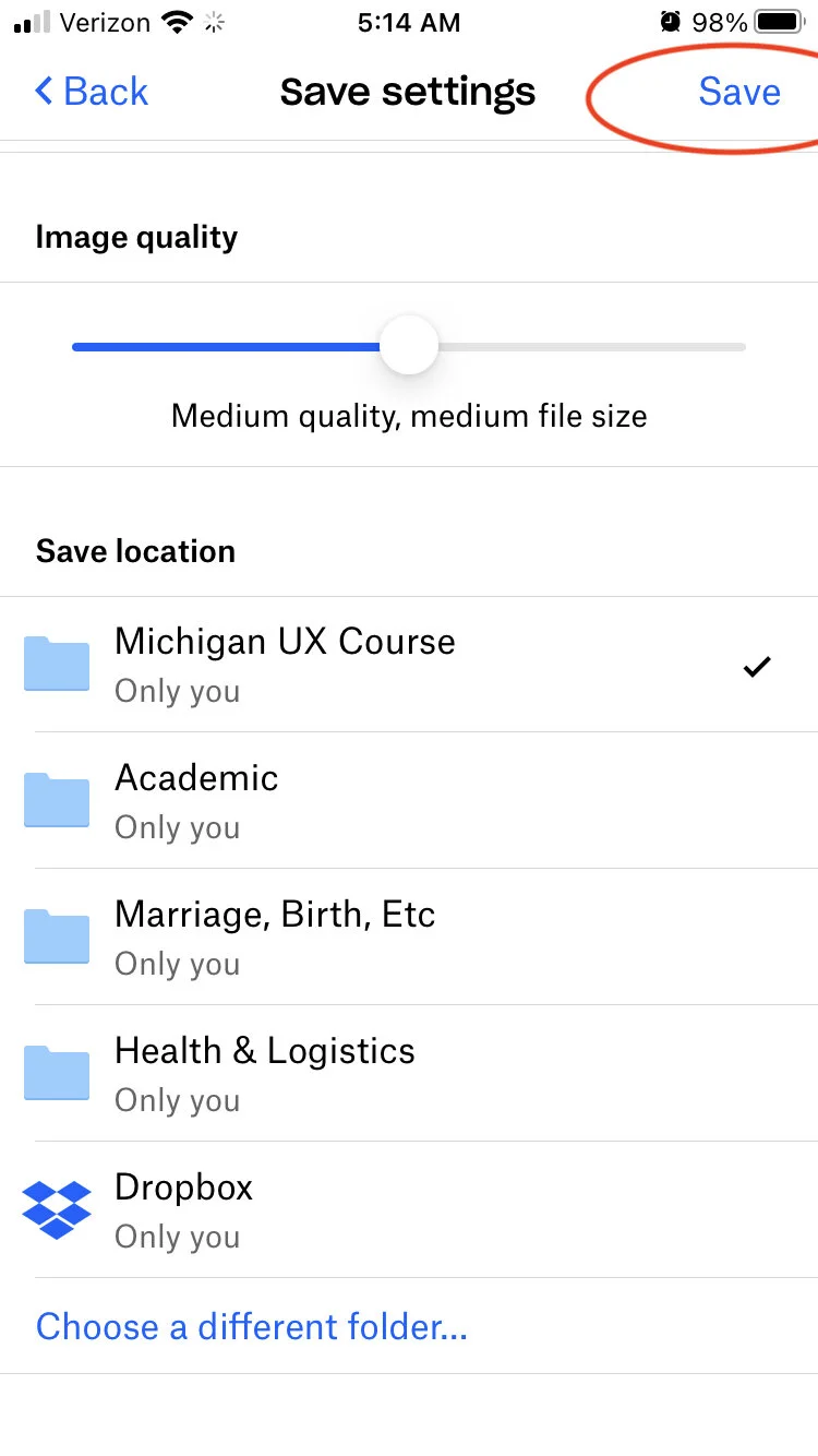
What I didn’t realize was that when I hit “save,” I was only saving the “save location.” Selecting “save” returns me to the main “save settings” screen again, where I have to click “save” on the upper right to actually store the document.
I return to the app, hoping the “save settings” screen is still available for me to finally save the document, but it has been deleted.
What I did and how I felt
As a user, this is a frustrating experience that also undermines my trust in the app. Maybe I have just spent 15 minutes scanning a long book chapter, only to find that all of my work has been wasted. Or I scanned an important document on the expectation that it would be available to me while away from my laptop, only to find that the document is not there when I need it.
Though I likely won’t drop the app for this reason, the experience undermines my trust in the app as I worry about the documents I thought I had saved but really didn’t.
(I also write to Dropbox with a suggestion to change the microcopy!)
The problem
When I click on “choose a different folder,” I can navigate through a series of arrow clicks to the folder I want. I find myself “inside” the folder I would like to save to. I am primed to interpret the “save” on the bottom right of the screen to mean “save here.”
The problem is one of task disambiguation. The sub-task of selecting a folder is nested within the larger task of saving the scan, and it is not clear to me when one task ends and the other begins.
At some point in selecting the folder, I felt that I had concluded the sub-task; something in the experience of navigating to the folder felt to me like an acknowledgment by the app that I had completed the sub-task when I hadn’t.
Also, the word “save” gets very meta here: when I click “save,” I am saving what the app calls the “save location.” So am I saving the location of where I will, ultimately, save the scan. Too many saves!
Solution #1
We can use a different word other than “save” to indicate that the sub-task of selecting a folder was completed, such as:
select
choose
Solution #2
We might introduce a conversational element. Instead of the very small prompt at the top to “choose a save location,” we might have a more engaging question, like:
“where would you like to save your scan?” —-> here
Making the question more visually prominent would help, too.
Solution #3
We might also structure the user interface differently to indicate more prominently that the user is carrying out a sub-task. The modal window of the current interface is subtle. Redesigning the modal window might be a better visual clue to users that they are carrying out a sub-task and that there are more steps to go to finalize the scan save once they complete this step.